Python for Big Data¶
An Example with Pandas, NumPy and Matplotlib¶
In this example, we will download some traffic citation data for the city of Bloomington, IN, load it into Python and generate a histogram. In doing so, you will be exposed to important Python libraries for working with big data such as numpy, pandas and matplotlib.
Set Up Directories and Get Test Data¶
Data.gov is a government portal for open data and the city of Bloomington, Indiana makes available a number of datasets there.
We will use traffic citations data for 2016.
To start, let’s create a separate directory for this project and download the CSV data:
$ cd ~/projects/i524
$ mkdir btown-citations
$ cd btown-citations
$ wget https://data.bloomington.in.gov/dataset/c543f0c1-1e37-46ce-a0ba-e0a949bd248a/resource/24841976-fd35-4483-a2b4-573bd1e77cfb/download/2016-first-quarter-citations.csv
Depending on your directory organization, the above might be slightly different for you.
If you go to the link to data.gov for Bloomington above, you will see
that the citations data is organized per quarter, so there are a total
of four files. Above, we downloaded the data for the first quarter. Go
ahead and download the remaining three files with wget.
In this example, we will use three modules, numpy, pandas and
matplotlib. If you set up virtualenv as described in the
Python tutorial, the first two of these are
already installed for you. To install matplotlib, make sure you’ve
activated your virtualenv and use pip:
$ source ~/ENV/bin/activate
$ pip install matplotlib
If you are using a different distribution of Python, you will need to make sure that all three of these modules are installed.
Load Data in Pandas¶
From the same directory where you saved the citations data, let’s start the Python interpreter and load the citations data for Q1 2016
$ python
>>> from __future__ import division, print_function
>>> import numpy as np
>>> import pandas as pd
>>> import matplotlib.pyplot as plt
>>> data = pd.read_csv('2016-first-quarter-citations.csv')
If the first import statement seems confusing, take a look at the
Python tutorial. The next three import
statements load each of the modules we will use in this example. The
final line uses Pandas’ read_csv function to load the data into a
Pandas DataFrame data structure.
Working with DataFrames¶
You can verify that you are working with a DataFrame and use some
of its methods to take a look at the structure of the data as follows:
>>> type(data)
<class 'pandas.core.frame.DataFrame'>
>>> data.index
Int64Index([  0,   1,   2,   3,   4,   5,   6,   7,   8,   9,
...
197, 198, 199, 200, 201, 202, 203, 204, 205, 206],
dtype='int64', length=200)
>>> data.columns
Index([u'Citation Number', u'Date Issued', u'Time Issued', u'Location ',
u'District', u'Cited Person Age', u'Cited Person Sex',
u'Cited Person Race', u'Offense Code', u'Offense Description',
u'Officer Age', u'Officer Sex', u'Officer Race'],
dtype='object')
>>> data.dtypes
Citation Number                object
Date Issued                    object
Time Issued                    object
Location                       object
District                       object
Cited Person Age              float64
Cited Person Sex               object
Cited Person Race              object
Offense Code                   object
Offense Description            object
Officer Age                   float64
Officer Sex                    object
Officer Race                   object
dtype: object
>>> data.shape
(200, 15)
As you can see from the columns field, when the CSV file was read,
the header line was used to populate the name of the columns in the
DataFrame. In addition, you will notice that read_csv
correctly inferred the data type of some columns like Age, but not
of others like Date Issued and Time Issued. read_csv is a very
customizable function and in general, you can correct issues like this
using the dtype and converters parameters. In this specific
case, it makes more sense to combine the Date Issued and Time
Issued columns into a new column containing a time stamp. We will see
how to do this shortly.
You can also look at the data itself with the DataFrame’s
head() and tail() methods:
>>> data.head()
<Output omitted for brevity>
>>> data.tail()
<Output omitted for brevity>
In addition to letting you examine your data easily, ``DataFrame``s have methods that help you deal with missing values:
>>> data = data.dropna(how='any')
>>> data.shape
Adding columns to the data is also easy. Here, we add two
columns. First, a datetime column that is a
combination of the Date Issued and Time Issued columns
originally in the data. Second, a column identifying what day of the
week each citation was given. To understand this example better, take
a look at the Python docs for the strptime and strftime
functions in the datetime module linked above.
>>> from datetime import datetime
>>> data['DateTime Issued'] = data.apply(
...  lambda row: datetime.strptime(row['Date Issued'] + ':' + row['Time Issued'], '%m/%d/%y:%I:%M %p'), axis=1
... )
>>> data.columns
>>> data['Day of Week Issued'] = data.apply(
...  lambda row: datetime.strftime(row['DateTime Issued'], '%A'), axis=1
... )
Plotting with Matplotlib and NumPy¶
Let’s say we want to see how many citations were given each day of the week. We gather the data first:
>>> days = ['Monday', 'Tuesday', 'Wednesday', 'Thursday', 'Friday', 'Saturday', 'Sunday']
>>> dow_data = [days.index(dow) for dow in data['Day of Week Issued']]
>>> dow_data
<Output omitted for brevity>
Then we use matplotlib to plot it:
>>> fig = plt.figure()
>>> ax = fig.add_subplot(1, 1, 1)
>>> plt.hist(dow_data, bins=len(days))
>>> plt.xticks(range(len(days)), days)
>>> plt.show()
You should see something like this on your screen:

More DataFrame Manipulation and Plotting¶
DataFrame``s and ``numpy give us other ways to manipulate
data. For example, we can plot a histogram of the ages of violators
like this:
>>> ages = data['Cited Person Age'].astype(int)
>>> fig = plt.figure()
>>> ax = fig.add_subplot(1, 1, 1)
>>> plt.hist(ages, bins=np.max(ages) - np.min(ages))
>>> plt.show()
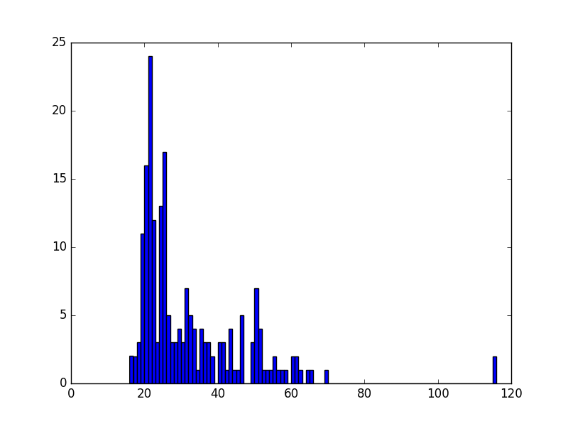
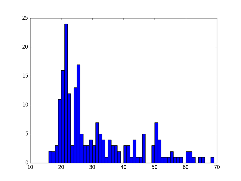
Surprisingly, we see some 116 year-old violators! This is probably an error in the data, so we can remove these data points easily and plot the histogram again:
>>> ages = ages[ages < 100]
>>> fig = plt.figure()
>>> ax = fig.add_subplot(1, 1, 1)
>>> plt.hist(ages, bins=np.max(ages) - np.min(ages))
>>> plt.show()
Saving Plots to PDF¶
Oftentimes, you will want to save your matplotlib graph as a PDF
or an SVG file instead of just viewing it on your screen. For both, we need to create a figure and plot the histogram as before:
>>> fig = plt.figure()
>>> ax = fig.add_subplot(1, 1, 1)
>>> plt.hist(ages, bins=np.max(ages) - np.min(ages))
Then, instead of calling plt.show() we can invoke
plt.savefig() to save as SVG:
>>> plt.savefig('hist.svg')
If we want to save the figure as PDF instead, we need to use the
PdfPages module together with savefig():
>>> import matplotlib.patches as mpatches
>>> from matplotlib.backends.backend_pdf import PdfPages
>>> pp = PdfPages('hist.pdf')
>>> fig.savefig(pp, format='pdf')
>>> pp.close()
Next Steps and Exercises¶
There is a lot more to working with pandas, numpy and
matplotlib than we can show you here, but hopefully this example
has piqued your curiosity.
Don’t worry if you don’t understand
everything in this example. For a more detailed explanation on these
modules and the examples we did, please take a look at the tutorials
below. The numpy and pandas tutorials are mandatory if you
want to be able to use these modules, and the matplotlib gallery
has many useful code examples.
Summary of Useful Libraries¶
Numpy¶
According to the Numpy Web page “NumPy is a package for scientific computing with Python. It contains a powerful N-dimensional array object, sophisticated (broadcasting) functions, tools for integrating C/C++ and Fortran code, useful linear algebra, Fourier transform, and random number capabilities
Tutorial: https://docs.scipy.org/doc/numpy-dev/user/quickstart.html
MatplotLib¶
According the the Matplotlib Web page, “matplotlib is a python 2D plotting library which produces publication quality figures in a variety of hardcopy formats and interactive environments across platforms. matplotlib can be used in python scripts, the python and ipython shell (ala MATLAB®* or Mathematica®†), web application servers, and six graphical user interface toolkits.”
Matplotlib Gallery: http://matplotlib.org/gallery.html
Pandas¶
According to the Pandas Web page, “Pandas is a library library providing high-performance, easy-to-use data structures and data analysis tools for the Python programming language.”
In addition to access to charts via matplotlib it has elementary functionality for conduction data analysis. Pandas may be very suitable for your projects.
Tutorial: http://pandas.pydata.org/pandas-docs/stable/10min.html
Pandas Cheat Sheet: https://github.com/pandas-dev/pandas/blob/master/doc/cheatsheet/Pandas_Cheat_Sheet.pdf
Other Useful Libraries¶
Scipy¶
According to the SciPy Web page, “SciPy (pronounced “Sigh Pie”) is a Python-based ecosystem of open-source software for mathematics, science, and engineering. In particular, these are some of the core packages:
- NumPy
- IPython
- Pandas
- Matplotlib
- Sympy
- SciPy library
It is thus an agglomeration of useful pacakes and will prbably sufice for your projects in case you use Python.
ggplot¶
According to the ggplot python Web page ggplot is a plotting system for Python based on R’s ggplot2. It allows to quickly generate some plots quickly with little effort. Often it may be easier to use than matplotlib directly.
seaborn¶
http://www.data-analysis-in-python.org/t_seaborn.html
The good library for plotting is called seaborn which is build on top of matplotlib. It provides high level templates for common statistical plots.
- Gallery: http://stanford.edu/~mwaskom/software/seaborn/examples/index.html
- Original Tutorial: http://stanford.edu/~mwaskom/software/seaborn/tutorial.html
- Additional Tutorial: https://stanford.edu/~mwaskom/software/seaborn/tutorial/distributions.html
Bokeh¶
Bokeh is an interactive visualization library with focus on web browsers for display. Its goal is to provide a similar experience as D3.js
pygal¶
Pygal is a simple API to produce graphs that can be easily embedded into your Web pages. It contains annotations when you hover over data points. It also allows to present the data in a table.
- URL: http://pygal.org/
Network and Graphs¶
REST¶
- django REST FRamework http://www.django-rest-framework.org/
- flask https://blog.miguelgrinberg.com/post/designing-a-restful-api-with-python-and-flask
- requests https://realpython.com/blog/python/api-integration-in-python/
- urllib2 http://rest.elkstein.org/2008/02/using-rest-in-python.html (not recommended)
- web http://www.dreamsyssoft.com/python-scripting-tutorial/create-simple-rest-web-service-with-python.php (not recommended)
- bottle http://bottlepy.org/docs/dev/index.html
- falcon https://falconframework.org/
- eve http://python-eve.org/
- https://code.tutsplus.com/tutorials/building-rest-apis-using-eve–cms-22961